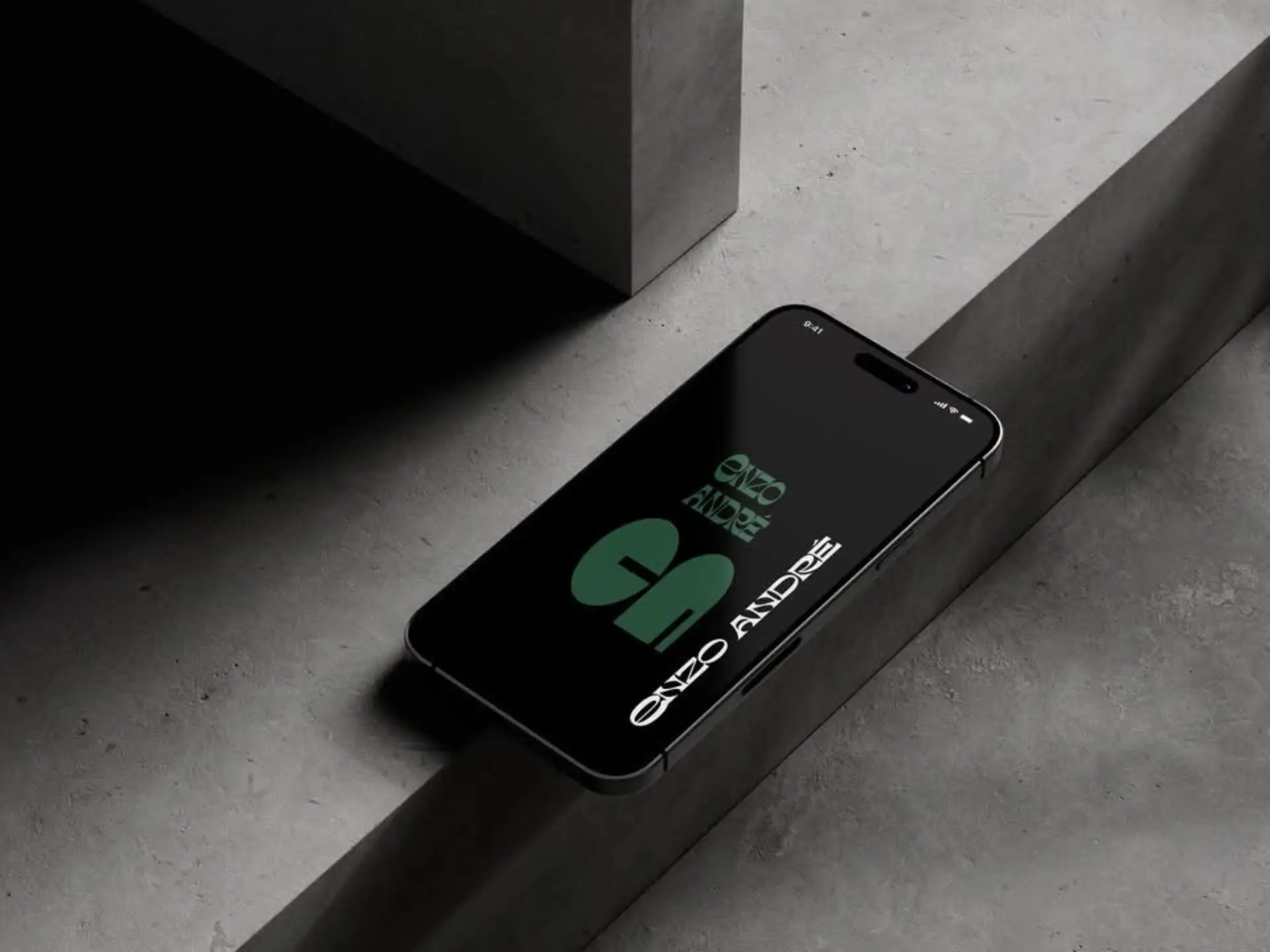
Deep Green (#496A58): Symbolizing stability, balance, and connection to nature — a reflection of timeless architectural design.
Black (#000000): Representing strength, sophistication, and modern professionalism.
This refined palette was chosen to create a minimal yet powerful visual identity that communicates both trust and elegance.
Branding Idea
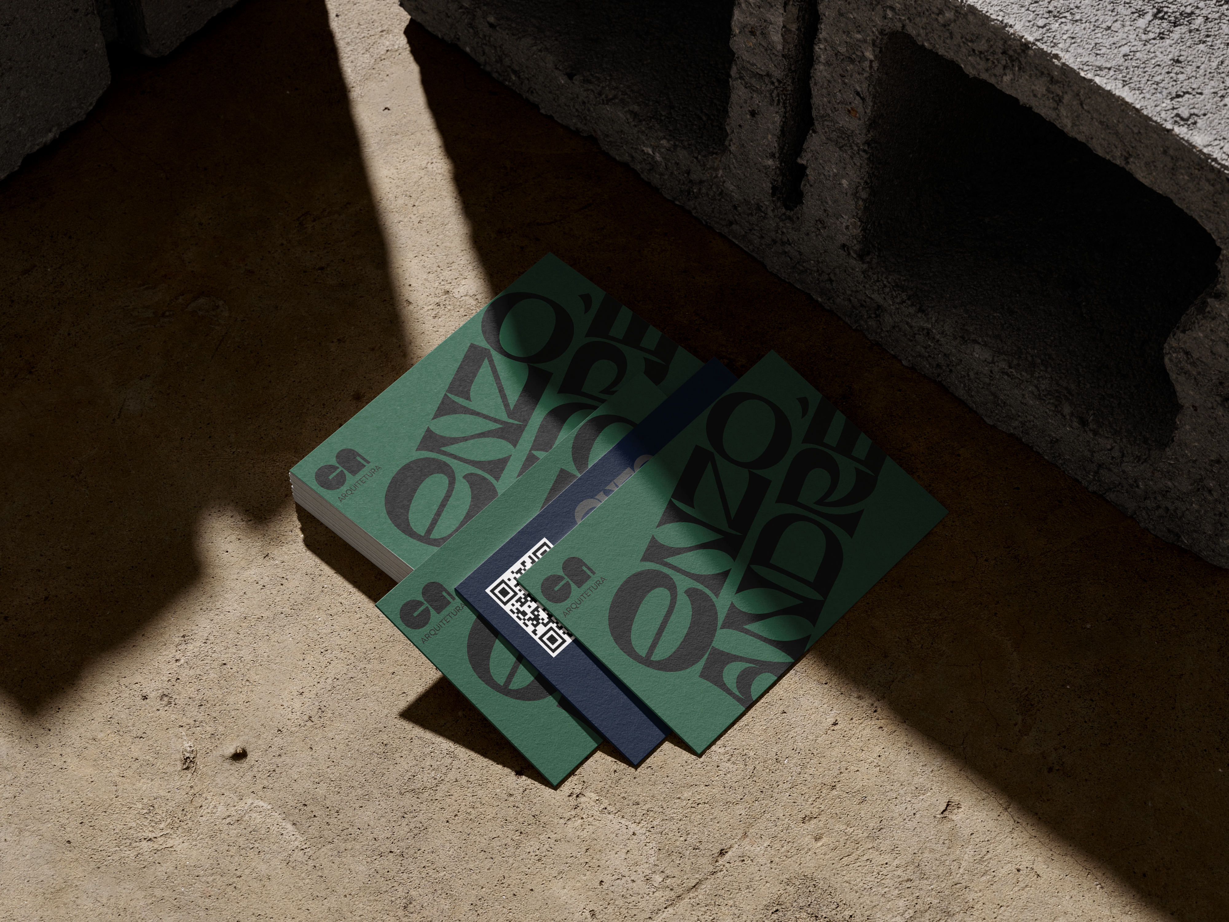
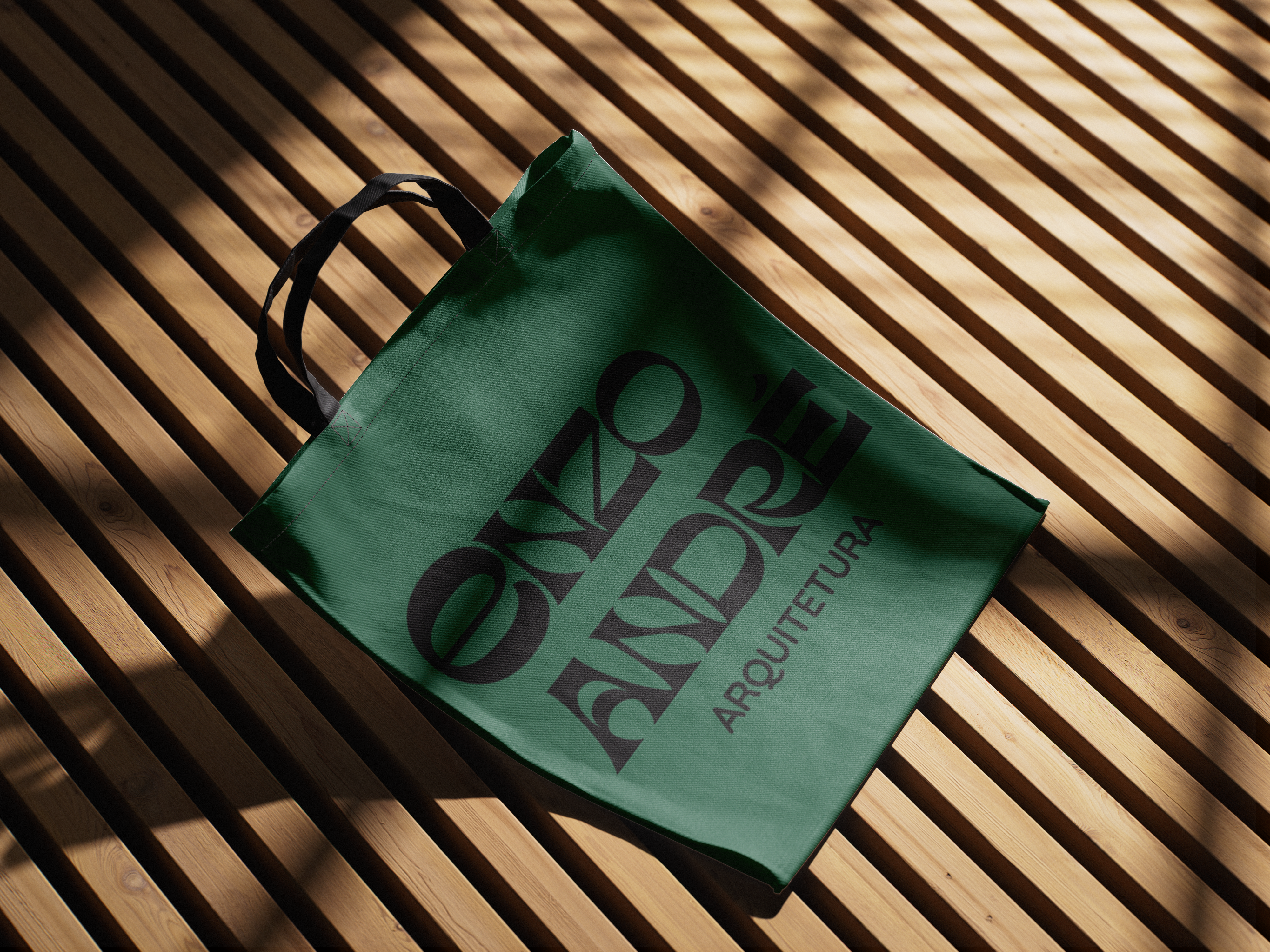
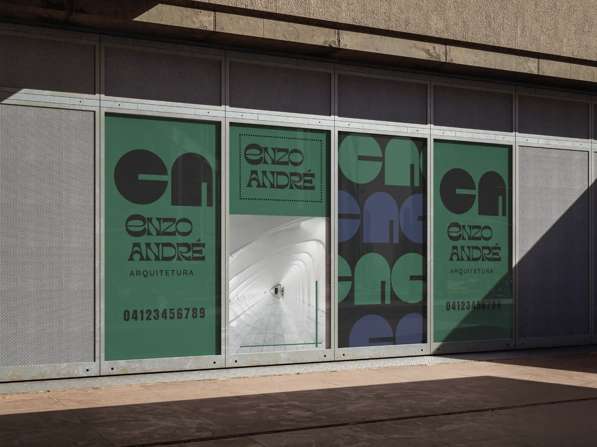
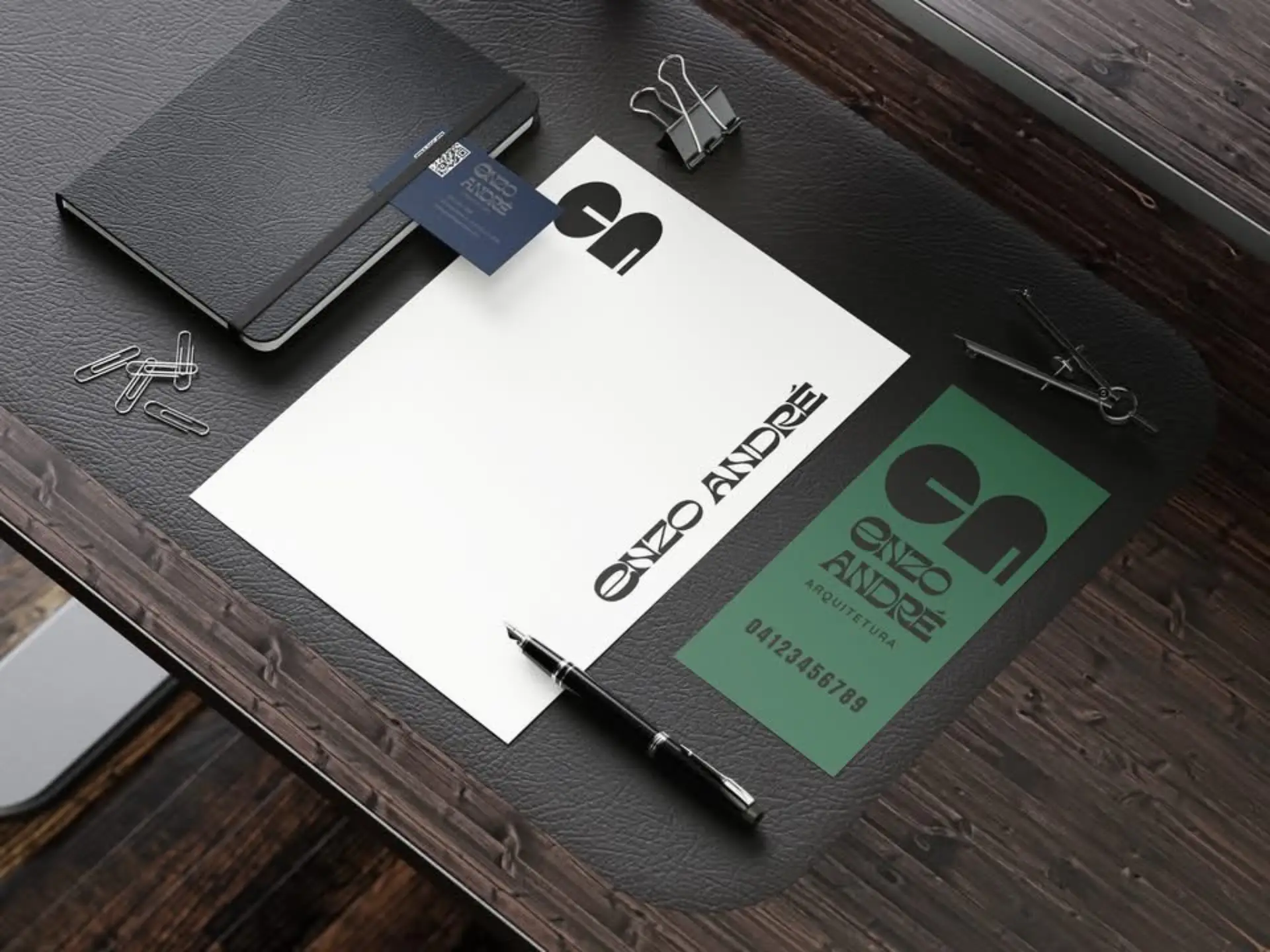
For Enzo Andre Arquitetura, we developed a branding concept that embodies modern architectural precision and natural balance. The visual direction focuses on clean, geometric elements paired with minimalist typography, ensuring the brand feels both professional and timeless.
The use of deep green grounds the brand in themes of sustainability, growth, and harmony with the environment, while black adds contrast and authority. Together, they create a striking balance , ideal for an architectural firm that values both creativity and structure.
We envisioned this branding applied across business cards, stationery, digital presence, and signage, giving Enzo Andre Arquitetura a cohesive and elegant identity that clients can instantly recognize.